Tableau: Delineate Belgian provinces explained
Tableau Software is a self-service BI-tool that allows data visualization, meaning that even business users should be able to easily visualise their data (without needing help of IT). You can check out the Tableau website for more information about this great tool.
As you may have already seen in several guides or tutorials, Tableau is able to link certain dimensions like postal code, countries, etc. to a certain geographical area. Unfortunately, most of these tutorials use data related to the United States of America. As of today, the Belgian geographical support is at a low point. One thing we can easily do though, is show the data based on provinces using their borders.
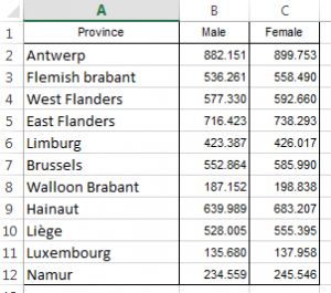
In this blog we’ll be showing the Belgian population per province in the year 2012 on a map. The data I used (and which you can see in the image below) can be downloaded from the Belgian Open Data website.
I’ve slightly altered the data so that we would have the English name for each province (else Tableau will not recognize it – you can also choose French or German).
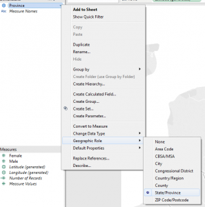
I’ve opened Tableau and loaded the data. Make sure that province is set as a geographical data type (State/Province). If this is not the case you can change it by right clicking on province and then selecting “Geographical Role” -> “State/Province”.
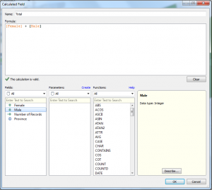
When using filled maps (=a type of map visualization that Tableau offers which will fill the area according to your chosen data), you can only use one measure. Therefore I’ve added a new calculated field “Total” (see “Analysis” -> “Create Calculated Field”) based on the male and female amount of people.
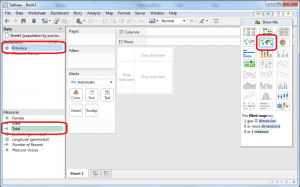
Now we will select both the province and the total and click on “Filled maps”.
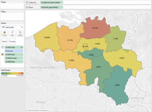
Tableau will automatically colour the provinces according to the amount of people who live there.
Now the only thing left to do is format your layout and then you’re done! I have coloured the provinces based on the % of the total (Red -> High %, Green -> Low %). I’ve also put the % of total in the label because I think showing the normal total would be unclear. The last thing I did was add the amount of males, females, total and total percentage to the label.
You can view the dashboard that I made for this blog on Tableau public. Tableau public is a free tool that Tableau offers which allows you to publish your data on the web for other people to see.
Extra tip: you can control click on multiple provinces to view the sum of the total % for the selected provinces.
Thank you for reading!

